In the age of information overload, crafting a newsletter that not only gets opened but also keeps readers engaged is a significant challenge. Yet, email newsletters remain one of the most effective tools for building lasting relationships with audiences. What separates a forgettable newsletter from one readers eagerly anticipate? The answer lies in effective design—both visual and structural. Let’s explore how smart newsletter design can retain readers and continually bring them back for more.
The Importance of First Impressions
Your newsletter’s design needs to make an instant impact. Most readers spend just a few seconds deciding whether to stay or click away. A clean, modern layout that reflects your brand’s identity is essential. Choose a simple color palette that aligns with your brand, avoid cluttered layouts, and make sure your logo is visible but not overpowering.
Fonts and typography also play a major role. Stick to readable typefaces and ensure appropriate contrast between the background and the text. Use headers and subheaders to break up content, and limit the number of font styles to maintain consistency and professionalism.
Mobile-First Design Is Non-Negotiable
Statistics show that the majority of recipients open their emails on mobile devices. A mobile-responsive design is no longer optional—it’s a necessity. Make sure your newsletter resizes flawlessly across screens of all sizes. Use single-column layouts, larger fonts, and tappable buttons to enhance usability on phones and tablets.
Pro tip: Use email testing tools to preview your newsletter on various devices before hitting send. A poor mobile experience is a fast track to unsubscribes.
Structure Content for Skimming
Modern readers skim emails rather than read them word-for-word. Designing for this behavior increases the chances that your key messages are seen.
Here are a few ways to make your content more skimmable:
- Use bullet points to break down complex information.
- Incorporate subheadings to guide the reader through topics.
- Add visual hierarchy by using different font sizes and weights for headings, subheadings, and body text.
- Include white space to give elements room to breathe.
Well-structured content also aids accessibility, allowing screen readers to better navigate your email, which is an inclusion win and improves user experience for all.
Consistency Creates Comfort
While creativity is welcome, consistency keeps readers comfortable. Establish signature elements—such as a specific header style, footer layout, or recurring content block (like “Editor’s Picks” or “Quote of the Week”)—that help create a rhythm readers can rely on.
This repeatability reinforces your brand’s identity and builds trust over time, encouraging engagement. People like knowing what to expect, and consistent design helps them mentally prepare for and absorb your content more easily.
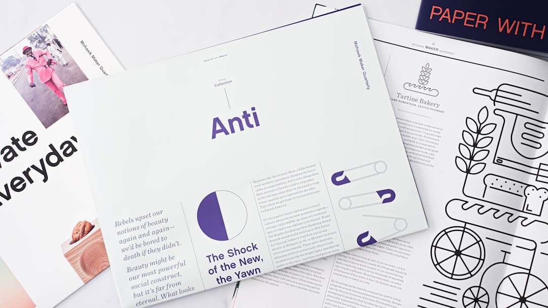
Use Engaging Visuals
Visuals aren’t just decoration—they’re a vital part of communication. A striking image or well-designed infographic can convey a message more effectively than a block of text.
When incorporating visuals, keep the following in mind:
- Optimize image size for fast loading without sacrificing quality.
- Use alt text so that image content is accessible to all readers, including those using screen readers.
- Don’t overdo it—balance text and visuals to avoid overwhelming the reader.
Animated GIFs and subtle motion elements can add flair, but use them sparingly to maintain professionalism and relevance.
Craft Magnetic CTAs (Calls-to-Action)
A great newsletter doesn’t just inform—it also guides the reader toward action. Whether you’re promoting a blog post, webinar, or product, your Calls-to-Action need to be clear, compelling, and strategically placed.
Tips for irresistible CTAs:
- Use action verbs like “Download,” “Join,” or “Explore.”
- Design buttons with contrasting colors that make them stand out.
- Limit CTAs to 1–2 per email to avoid overwhelming the reader.
Also consider A/B testing different CTA styles and placements to identify what resonates best with your audience over time.
Personalization Fosters Connection
Today’s readers expect content tailored to their interests. Using personalization in your design—not just in the content—can elevate engagement significantly.
For example:
- Dynamic sections based on user preferences can show different content blocks depending on what the reader has interacted with before.
- Smart recommendations like “You might like…” based on purchase or browsing history make the newsletter feel custom-made.
While personalization requires data and the right email platform, it greatly enhances the value your readers receive, increasing the likelihood that they’ll keep reading—and clicking.
Maintain a Balanced Rhythm
Your design strategy should also account for how often you send your newsletter. Even the best-designed email will fatigue readers if delivered too frequently. Conversely, too low a frequency risks being forgotten.
Use analytics to find the sweet spot for your audience. Design a content calendar that allows your team to deliver consistently valuable content without overwhelming readers or burning out your writers and designers.
Test, Evaluate, and Evolve
The best design is an evolving one. Use A/B testing to refine everything from subject lines and header images to layout styles and CTA language. Monitor metrics like open rates, click-through rates, and unsubscribe rates to gain insight into what’s working—and what needs to change.
Listening to your audience through surveys or interactive polls in your newsletter can also guide future design improvements.
Examples of High-Retention Design Elements
To wrap up, here are a few specific design features often found in high-retention newsletters:
- Table of contents at the top linking to internal sections, helping readers navigate longer newsletters.
- Modular layouts using content blocks that can be easily rearranged or updated.
- Spotlight features on team members, customers, or community stories to humanize your content.
- Interactive elements like polls or feedback buttons to engage readers directly.
These are more than just bells and whistles—they’re tactical choices that turn passive readers into loyal subscribers.
Final Thoughts
Design plays a crucial role in newsletter success. It sets the tone, guides the reader’s eye, and communicates your brand’s values without saying a word. By delivering a seamless, visually appealing, and value-packed experience, you increase the chances of turning a one-time reader into a dedicated follower.
And in the noisy world of email inboxes, that loyalty is priceless.