Data surrounds modern organizations, educators, researchers, and entrepreneurs. Yet raw numbers alone rarely inspire confidence or clarity. To make informed decisions, stakeholders need visual tools that translate figures into insight. One of the simplest yet most powerful visualization methods is the pie chart. If you have not already experimented with a pie chart maker, it may be time to try one and experience firsthand how effectively it communicates proportional data.
TLDR: A pie chart maker transforms raw numerical data into clear, proportional visual insights. It is especially useful for illustrating percentages and comparative segments within a whole. Modern tools offer customization, collaboration, and export options suitable for professional environments. Trying a pie chart maker can enhance presentations, reporting accuracy, and strategic decision-making.
A pie chart maker is a digital tool designed to convert categorized data into a circular diagram divided into segments. Each slice represents a proportion of the total, making it easy to compare distributions at a glance. Unlike spreadsheets filled with rows of numbers, pie charts distill complex information into a visual summary that audiences can immediately understand.
Why Visual Data Representation Matters
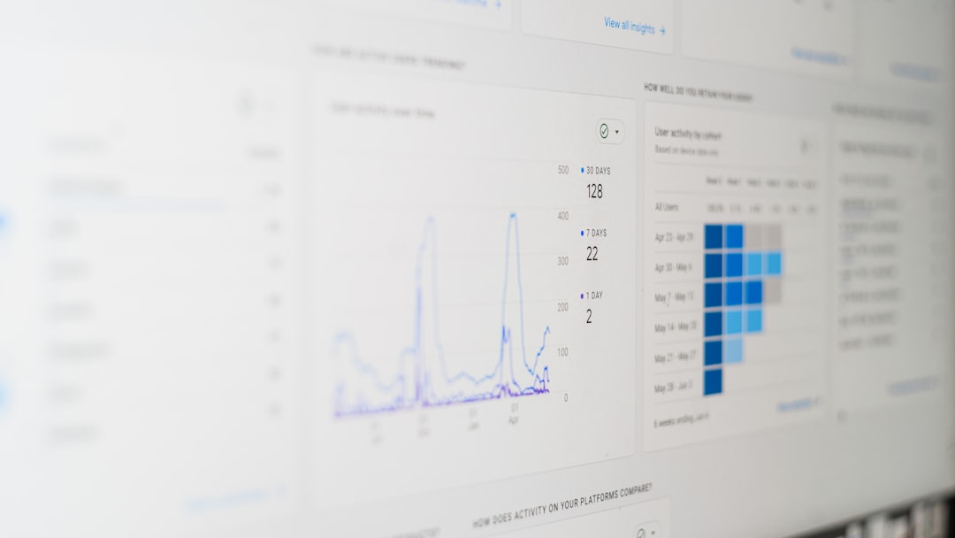
Visual representation is not merely aesthetic—it is cognitive. Research consistently demonstrates that humans process visual information faster than text or numerical tables. When presenting budget allocations, survey results, sales distributions, or demographic data, decision-makers benefit from a concise visual breakdown.
A pie chart maker helps you:
- Clarify proportions between categories.
- Highlight dominant segments within a dataset.
- Simplify communication during meetings and presentations.
- Support evidence-based decisions with accessible visuals.
For example, if a marketing team needs to show how a budget is divided between digital ads, print, events, and research, a pie chart instantly communicates whether one area disproportionately consumes resources. This transparency strengthens analytical discussions and reduces misunderstandings.

Key Features to Look for in a Pie Chart Maker
Not all pie chart tools are equally reliable or professional. When trying out a pie chart maker, consider features that enhance both functionality and credibility.
1. Ease of Data Input
The most effective tools allow direct input through forms, spreadsheet uploads, or integration with existing data platforms. A clear interface reduces the likelihood of data entry errors and ensures accuracy.
2. Customization Options
Professional environments often require branding standards. A trustworthy pie chart maker should allow you to:
- Adjust color palettes
- Edit labels and legends
- Modify fonts and styles
- Include percentage values or raw numbers
Customization does not merely improve aesthetics; it enhances clarity and consistency across documents and presentations.
3. Real-Time Updates
Dynamic charts that update automatically when data changes are particularly valuable. This reduces duplication of work and ensures that presentations always reflect the latest figures.
4. Export and Sharing Capabilities
A professional pie chart maker should allow exporting in multiple formats such as PNG, PDF, or SVG. Cloud-based sharing and collaboration options also facilitate teamwork, particularly for remote teams or distributed departments.
When to Use a Pie Chart
Although pie charts are highly effective, they are most appropriate under specific conditions. They work best when:
- The dataset represents parts of a whole (e.g., 100%).
- The number of categories is limited, ideally fewer than seven.
- The objective is to compare proportional shares rather than precise values.
If you have dozens of categories or require precise comparisons between nearly identical values, other chart types such as bar graphs may be preferable. However, for high-level summaries, pie charts remain one of the most intuitive and persuasive tools.

Benefits Across Professional Fields
Trying out a pie chart maker is not limited to corporate analysts. Its applications extend across numerous sectors.
Business and Finance
Financial reports often include revenue segmentation, cost distribution, and investment allocation. Executives reviewing quarterly results benefit from immediate visual summaries that help identify strengths and inefficiencies.
Education
Teachers and academic researchers use pie charts to illustrate survey responses, attendance patterns, and grading distributions. Students also benefit from learning how data visualization strengthens analytical thinking.
Healthcare
Healthcare administrators use pie charts to represent patient demographics, treatment allocations, or departmental expenses. Clarity is critical when communicating operational information to diverse stakeholders.
Marketing and Communications
Marketers frequently rely on pie charts to present audience segmentation, campaign channel performance, or customer preference breakdowns. When time is limited during presentations, immediate visual impact is invaluable.
Common Mistakes to Avoid
Even with a reliable pie chart maker, improper usage can reduce credibility. Avoid the following:
- Overloading the chart with too many slices.
- Using similar colors that blur distinctions between segments.
- Neglecting labels or legends, which create confusion.
- Including unrelated data that does not represent a whole.
A serious and trustworthy presentation requires thoughtful data preparation. Before generating a chart, verify that totals add up correctly and categories are clearly defined.
How to Get Started
Trying a pie chart maker is straightforward. Most platforms follow a similar process:
- Prepare your categorized data.
- Enter or upload data into the tool.
- Select pie chart as the visualization type.
- Customize labels, colors, and formatting.
- Review for accuracy and clarity.
- Export or share the finished chart.
Before presenting, take a moment to step back and evaluate whether the chart communicates its message within a few seconds. If viewers need extended explanation to interpret it, consider simplifying your data or adjusting formatting.

Enhancing Strategic Decision-Making
One of the understated advantages of a pie chart maker is its contribution to strategic conversations. When teams see proportional breakdowns clearly displayed, discussions become more focused and objective. Instead of debating assumptions, participants can reference shared visual evidence.
For example, if 60% of operational costs stem from logistics, leadership can target that category for efficiency improvements. If customer acquisition channels show a dominant contributor, marketing refinement becomes data-driven rather than speculative.
The ability to visualize distribution helps transform abstract metrics into actionable insight.
Building Trust Through Accurate Presentation
Trust is central to professional communication. Whether addressing board members, clients, or colleagues, accuracy and transparency build credibility. A properly constructed pie chart signals preparation and analytical competence.
However, integrity must remain paramount. Avoid manipulating segment sizes visually or excluding relevant categories to present a misleading impression. Ethical data representation reinforces long-term trust and strengthens organizational reputation.
The Broader Value of Data Literacy
Trying out a pie chart maker is more than a technical exercise—it is a step toward improved data literacy. As organizations increasingly rely on analytics, personnel at every level benefit from understanding how to interpret and present figures responsibly.
Developing data literacy includes:
- Understanding the difference between absolute and relative values.
- Recognizing limitations of certain chart types.
- Ensuring statistical validity before visualization.
- Communicating findings clearly and honestly.
A pie chart maker becomes not merely a convenience, but a practical tool within a broader culture of analytical thinking.
Conclusion
In a world defined by information flow, the ability to present data effectively distinguishes strong communicators from average ones. A pie chart maker provides a structured, intuitive way to visualize proportions and support professional discussions. By selecting a reliable tool, maintaining accuracy, and applying thoughtful design principles, you can transform raw numbers into meaningful insights.
Trying out a pie chart maker is a modest investment of time with significant returns. It enhances clarity, promotes accountability, and strengthens the impact of your reports and presentations. For professionals committed to precision and credibility, it is a practical resource worth integrating into regular workflows.
