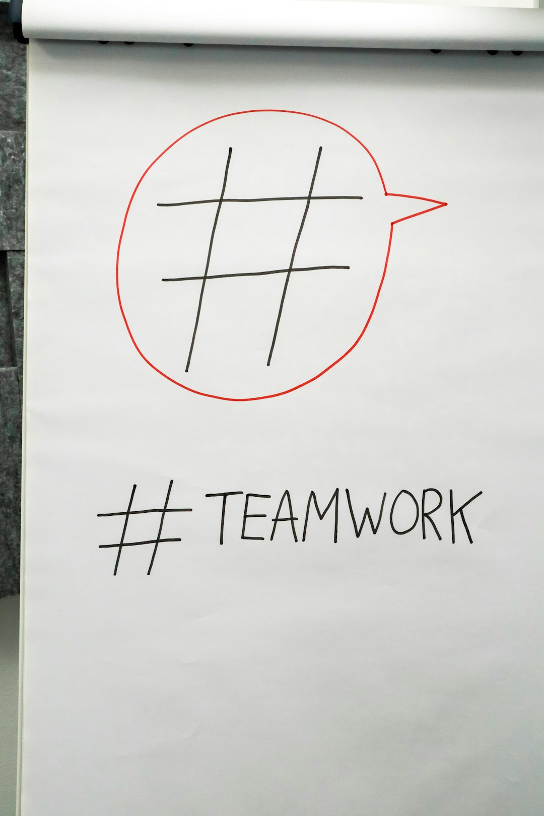
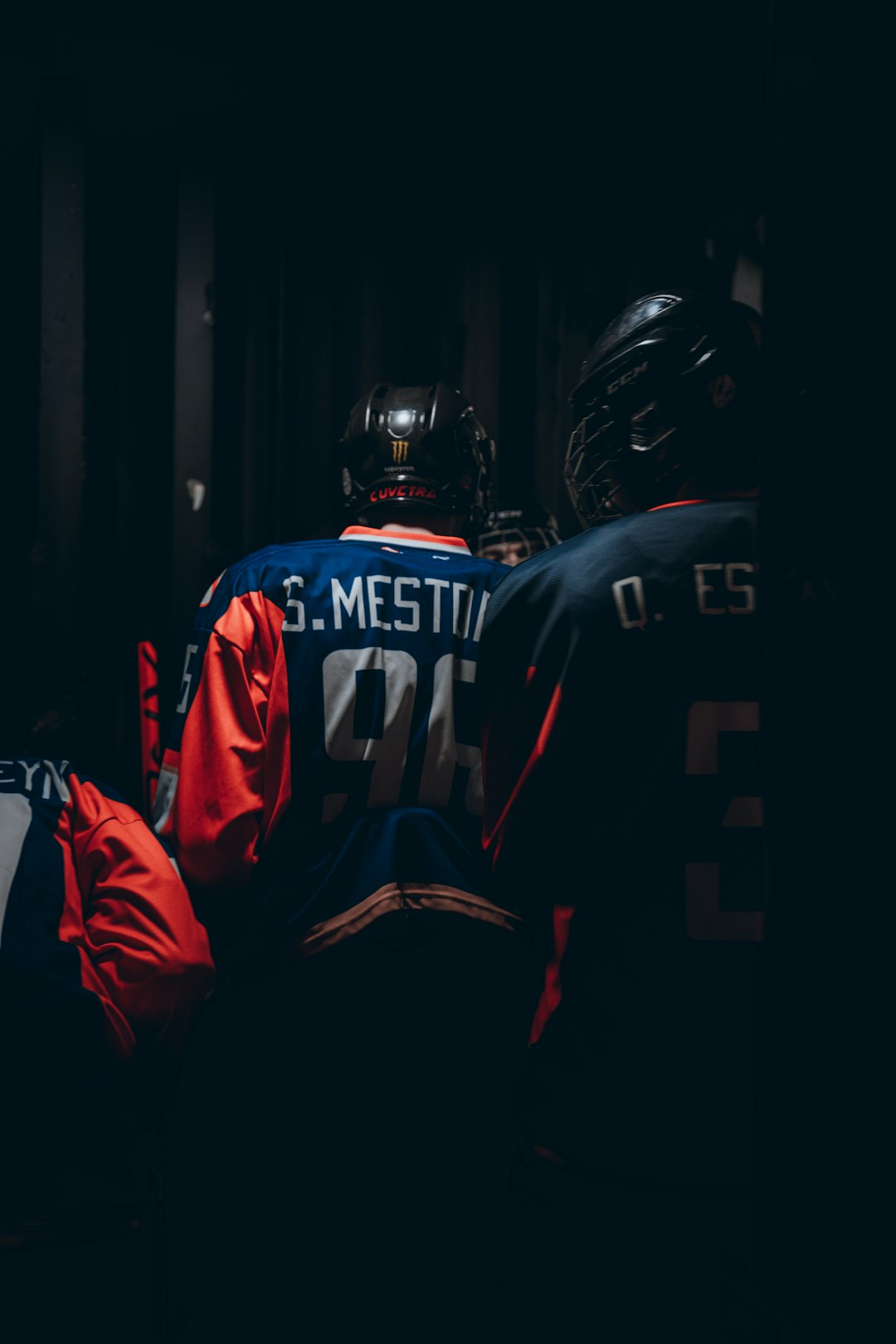
In modern sports, a jersey is more than a piece of performance apparel; it is a moving billboard, a symbol of loyalty, and a visual handshake between a team and its supporters. A strong jersey logo can make a club instantly recognizable from the stands, on broadcasts, across social media, and in merchandise shops. Whether it belongs to a school team, a local league, an esports squad, or a professional franchise, the logo sets the tone for how the team is perceived.
TLDR: Jersey logos are central to sports branding because they communicate identity, attitude, history, and team spirit in a single visual mark. The best designs are simple, scalable, memorable, and easy to apply across uniforms, merchandise, digital graphics, and stadium signage. Strong uniform design balances color, typography, symbols, placement, and tradition while still leaving room for fresh seasonal updates. Teams that invest in a clear visual system often create stronger fan loyalty and more professional brand recognition.
The Role of Jersey Logos in Sports Branding
A jersey logo often becomes the most visible part of a team’s brand. While a team may have a full identity system that includes mascots, slogans, alternate marks, color palettes, and typography, the jersey logo must carry the brand in its most compact form. It has to work when embroidered on fabric, printed on fan gear, displayed on a phone screen, or seen from a distance during fast gameplay.
For this reason, successful sports branding usually begins with clarity. A logo should tell supporters who the team is and what kind of energy it represents. A lion may suggest courage, a lightning bolt may suggest speed, and a shield may imply heritage and defense. Even abstract marks can work if they communicate motion, confidence, or unity. The goal is not simply to decorate a jersey, but to create a symbol that people want to wear with pride.
Strong jersey branding typically achieves three things:
- Recognition: Fans and opponents can identify the team quickly.
- Emotion: The mark creates pride, excitement, nostalgia, or intimidation.
- Consistency: The identity works across uniforms, merchandise, signage, and media graphics.
What Makes a Great Jersey Logo?
A great jersey logo is not always the most complex or detailed design. In fact, the most effective marks are often simple enough to remember after a single glance. Sports logos must survive constant movement, changing camera angles, different lighting conditions, fabric textures, and repeated reproduction. Overly detailed illustrations may look impressive on a large poster but become muddy when stitched on a small chest patch.
Simplicity is one of the most important principles. A logo should have a clear silhouette, limited details, and a strong central idea. This does not mean it has to be boring. It means every line, shape, and color should serve a purpose.
Scalability is equally important. A jersey logo should look good on a full-front basketball jersey, a small hockey shoulder patch, a baseball cap, a website icon, and a social media avatar. If the design loses its impact when reduced, it may need to be simplified.
Memorability separates good sports logos from forgettable ones. A memorable logo may use a distinctive mascot pose, a unique letterform, a clever negative-space element, or a bold color pairing. It should be easy for fans to describe and easy for younger supporters to recognize.
Versatility also matters. Teams often need primary logos, alternate logos, monochrome versions, embroidery-friendly versions, and sponsor-compatible layouts. A flexible logo system helps maintain brand consistency without forcing the same design into every situation.
Choosing Symbols and Mascots
Many jersey logos are built around mascots because mascots create instant personality. Animals, mythical creatures, warriors, natural forces, and local icons are common choices. However, a mascot should never feel random. It should connect to the team’s location, culture, values, or playing style.
Animal mascots remain popular because they communicate qualities quickly. Eagles suggest vision and dominance, wolves suggest teamwork, bears suggest power, and sharks suggest aggression. Mythological symbols can add drama and uniqueness, while local landmarks can strengthen community identity. A coastal team might use waves or anchors; a mountain team might use peaks, pine trees, or a rugged animal native to the region.
Letter-based logos are another strong option. Monograms, initials, and custom wordmarks can feel classic and timeless. They are especially effective for baseball, college athletics, golf teams, tennis clubs, and organizations that want a refined or heritage-driven identity. When designed well, a simple lettermark can become just as iconic as a mascot.
Color Strategy for Jersey Logos
Color is one of the fastest ways to create brand recognition. Some teams become so closely associated with their colors that fans can identify them before seeing the logo. A strong jersey color palette should be distinctive, practical, and emotionally aligned with the team’s identity.
Primary colors define the main personality of the brand. Red often communicates energy, urgency, and passion. Blue can suggest trust, discipline, and tradition. Black may express strength, authority, or intimidation. Green can feel connected to nature, growth, or local heritage. Orange and yellow bring visibility, warmth, and excitement.
Secondary colors help add depth and flexibility. A team may use silver, gold, white, navy, or charcoal as supporting colors for outlines, numbers, trim, or alternate jerseys. The key is to prevent the palette from becoming too crowded. Most successful sports uniforms use two or three dominant colors, with additional tones used sparingly.
Contrast is also crucial. A logo must stand out clearly against home, away, and alternate jerseys. Designers often prepare light and dark versions of the same mark so the logo remains readable on different backgrounds. A white outline around a dark mascot, for example, may help it pop on a navy or black jersey.
Typography and Number Design
Typography plays a major role in uniform design. Names, numbers, city names, team names, and sponsor labels all interact with the logo. A jersey may have a strong emblem, but poor type choices can weaken the overall presentation.
Custom lettering often gives a team a more professional look. Block numbers can feel traditional and athletic, while angled or condensed numbers suggest speed and intensity. Rounded type may feel friendly or modern, while sharp serif styles can create a sense of heritage or prestige. The type should match the logo’s mood rather than compete with it.
Readability must remain a top priority. During a game, officials, broadcasters, fans, and teammates need to identify players quickly. Numbers should be large enough, high contrast, and free of unnecessary decorative clutter. Jersey typography can be stylish, but it must also be functional.
Logo Placement on Jerseys
Placement affects how a jersey logo is perceived. Different sports have different traditions and practical requirements. A basketball jersey often features a wordmark or team name across the chest. A soccer jersey may place a crest over the heart, with a sponsor mark at the center. A hockey jersey frequently uses a large central crest, while baseball jerseys may use a script wordmark, chest logo, or cap monogram.
Common jersey logo placements include:
- Center chest: Bold and traditional for hockey, basketball, and some football uniforms.
- Left chest: Common for soccer crests, baseball marks, and minimalist athletic apparel.
- Shoulder patches: Useful for alternate logos, league marks, or commemorative symbols.
- Sleeve logos: Effective for sponsors, heritage marks, or small mascot icons.
- Back neck area: A subtle place for slogans, initials, or secondary symbols.
The best placement depends on the sport, the uniform cut, the visibility requirements, and the overall branding strategy. A logo should not be squeezed between seams, hidden by equipment, or overwhelmed by sponsor graphics.
Home, Away, and Alternate Uniform Ideas
A complete uniform identity usually includes multiple jersey versions. Home uniforms often use the team’s primary color, while away uniforms may use white, light gray, or another high-contrast option. Alternate jerseys provide room for creativity and can become major merchandise drivers.
Home jerseys should feel definitive. They represent the core brand and are often the version most associated with the team. The primary logo, main colors, and standard typography should be presented clearly.
Away jerseys should maintain brand consistency while offering strong contrast. A team may use the same logo with reversed colors or a simplified version that performs better on a lighter fabric.
Alternate jerseys are ideal for experimentation. Teams may introduce throwback designs, blackout uniforms, city-inspired patterns, special event editions, or jerseys that highlight community culture. However, alternates should still feel connected to the main identity. If an alternate uniform looks like it belongs to a completely different organization, it may confuse fans.
Heritage, Storytelling, and Local Identity
The strongest jersey logos often tell a story. Sports fans appreciate meaning, especially when a design connects to local history, regional pride, or team tradition. A crest may include the year a club was founded, a reference to a famous landmark, or a subtle symbol tied to the community.
Storytelling can also appear through patterns and trim. A basketball team might use side panels inspired by local architecture. A soccer club might include a small symbol from the city flag. A hockey team might use sleeve stripes that reference a historic uniform. These details give fans something to discover and discuss.
However, symbolism should be controlled. Too many hidden meanings can make a design feel cluttered. A jersey logo works best when the main idea is immediately clear and the deeper details reward closer inspection.
Trends in Modern Jersey Logo Design
Sports branding continues to evolve. Many teams are simplifying their logos to improve digital performance and merchandising. Flat shapes, bold outlines, and cleaner typography are increasingly common because they reproduce well across screens and fabrics.
Another trend is the rise of minimalist crests. These marks use simple icons, initials, or geometric forms rather than detailed illustrations. They can feel modern and premium, especially for soccer clubs, fitness teams, and esports organizations.
Retro styling is also popular. Throwback wordmarks, vintage scripts, old-school mascots, and classic stripes can create nostalgia. When used carefully, retro elements remind fans of a team’s history while still feeling fresh.
Pattern-based uniforms are gaining attention as well. Subtle tonal graphics, cultural motifs, topographic lines, camouflage effects, and city-map textures can make a jersey unique without overpowering the logo. The best patterns support the brand rather than distract from it.
Practical Design Tips for Teams
Teams developing a new jersey logo should think beyond the first impression. A design might look exciting on a flat screen, but it also needs to be practical for production. Embroidery, screen printing, heat transfer, sublimation, and woven patches all have different limitations.
Useful guidelines include:
- Test the logo at multiple sizes before finalizing it.
- Create one-color and full-color versions for flexible applications.
- Check contrast on both light and dark jersey backgrounds.
- Avoid extremely thin lines that may disappear in stitching or printing.
- Keep sponsor placement in mind so the uniform does not look crowded.
- Build a small brand guide that defines colors, fonts, logo spacing, and usage rules.
A thoughtful process helps prevent costly redesigns and inconsistent merchandise. It also ensures that coaches, players, vendors, and marketing teams use the logo correctly.
Balancing Tradition and Innovation
One of the biggest challenges in sports uniform design is balancing tradition with change. Fans may love a classic logo and resist major updates, especially if the existing identity is tied to memorable seasons or championship moments. At the same time, every brand must remain relevant to new generations.
A smart redesign does not always require a complete overhaul. Sometimes the best approach is refinement: cleaning up outlines, improving symmetry, modernizing typography, or adjusting colors for better contrast. These updates can make a logo more functional while preserving its emotional value.
For newer teams, innovation may be easier. They can introduce bold colors, unusual mascots, modern crests, or flexible digital-first identity systems. Still, even new brands should aim for longevity. A jersey logo should not rely entirely on short-lived trends.
FAQ
What is the most important quality of a jersey logo?
The most important quality is recognition. A jersey logo should be clear, memorable, and easy to identify from a distance, during motion, and across different media.
How many colors should a sports jersey logo use?
Most effective logos use two to four colors. A limited palette improves consistency, reduces production issues, and helps the team build stronger visual recognition.
Should a team use a mascot or a letter logo?
Either can work. A mascot adds personality and energy, while a letter logo or monogram can feel timeless and versatile. The best choice depends on the team’s history, audience, sport, and desired image.
Where should a logo be placed on a jersey?
Placement depends on the sport and uniform style. Center chest, left chest, sleeves, shoulders, and back neck areas are all common options. The logo should remain visible, balanced, and unobstructed by equipment or sponsor marks.
What makes an alternate jersey successful?
A successful alternate jersey feels fresh while staying connected to the team’s core identity. It may use a new color arrangement, throwback styling, or local theme, but it should still be recognizable as part of the same brand.
Why is typography important in uniform design?
Typography affects readability, style, and brand personality. Player names, numbers, and wordmarks must be clear during gameplay while matching the attitude of the logo and overall uniform.
How often should a team update its jersey logo?
There is no fixed schedule. Some teams keep their logos for decades, while others make small updates every few years. A redesign is most useful when the current logo feels outdated, difficult to reproduce, or disconnected from the team’s direction.